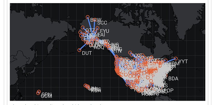
New map looks really awful on mobile devices
I’ll see what I can do, but other than skipping the labels or even the airport markers, I’m not sure what could be done about this, given a certain size of the airline in question.
That said, I don’t want to spend too much time on fiddling with this (already said that on a devlog about this), because there are endless ways one could “perfect” this ![]()
Tweaked this a little bit in that
- below 500px map width, no labels are rendered and
- the width/size of markers and paths scales with the size of the map.
This is still far from perfect, though. I argue that it is near impossible to render a sensible map of hundreds of routes on the area equivalent to that of a postage stamp ![]()
Changes will be rolled out later today or tomorrow with a small maintenance patch.
Just wanted to say that the changes make it look a lot cleaner, thanks for being responsive!
Martin, Is there a way to get a better contrast in the new maps. I like them but the black on dark blue is not easy to see. Maybe a lighter blue?
Mike
Can you elaborate what you mean by “black on dark blue”? Because I don’t think I have added a dark blue anywhere ![]()
Sorry i ment the oceans are black at the moment and the land is dark grey. The contrast is very low. It would be better to have a lighter color ocean (light blue?), dark grey land and blue lines
