What is this…? Numbers but no magoc
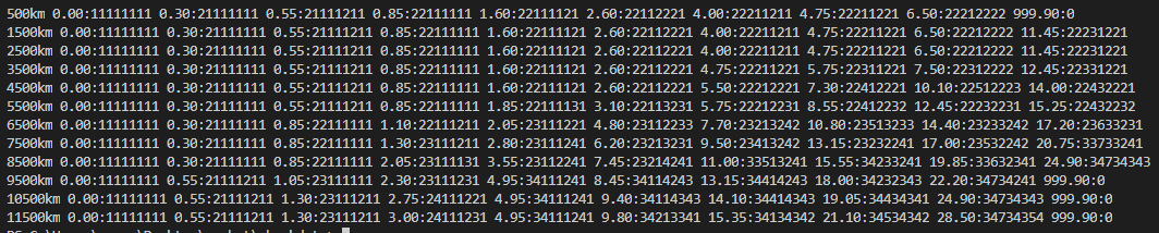
Cheapest service profiles for Economy, for each range and rating.
Tried to do Business as well but way too many combinations to do so I couldn’t try every case.
The Y axis is obviously the distance - 500km 1500km etc
The X axis is the rating 5 reds, 4 reds etc.
The values are the price : the options for each of the 10 categories. 1 = nothing, 2 = first option etc.
I just tested it and from my point of view the chart is not fully correct. E.g. up to 1800km I achieve 5 greens with 22221122 which is 11,25.
I did include the 800s in the test but ignored them in the final check, thought they could be fully covered by the 500s. I guess not.
That is totally correct!
I’ll run through the raw data again and include the 800s. Will do an update.
I suspect that if you did this in a spreadsheet it would be easier to read and possibly easier to show for the increased options for business and first class.
I must admit I had thought of doing something like this myself.
Sorry for my earlier comment. I looked at it not carefully.
Has anyone made a magic table for business or first? This is great!
There is nothing magic about it. In less than 10 minutes you can figure out the manage yourself.
No, not yet. It is unfortunately too complex, and first class I believe just caps out at some long range kilometer that I cannot get off the tip of my tongue.
–
Again, what is up with the knee jerking and scoffing lately? It is not hard to reply to the comment nicely, CP…