It’s the long Easter weekend here in Germany, so I am technically off duty today. But it’s also a Monday, so it’s devlog time ![]()
Also, in week 14, it finally happened: I really, really got started on UI design again (after week 13 slid in last-minute with a blocking issue…).
Tool UI design work
Ironically, the first bit of “UI work” I took care of last week had nothing to do with the game’s UI at all, but rather with our internal aircraft data editor. Since I haven’t talked about it in a while, a reminder: This editor is an internal tool that we use to capture information from the so-called “Airport Planning Manuals” that aircraft manufacturers provide in a somewhat standardised format for - well - airport planning purposes. These manuals are our primary source for verified performance data. The way the tool works is that it allows us to “measure” the charts in those documents and overlay plots of our own performance calculations. We then try to get the original charts and our plots to match as closely as possible. Ideally, we end up with a set of parameters that we can feed into the game.
Now @Priller requested the ability to change the colors of the reference lines and plots because some manufacturers (looking at a European manufacturer in particular who some might have heard of…) went a bit too creative in their choice of colors, so I took care of that real quick.
Long story short, this is what this piece of art ended up looking like eventually:
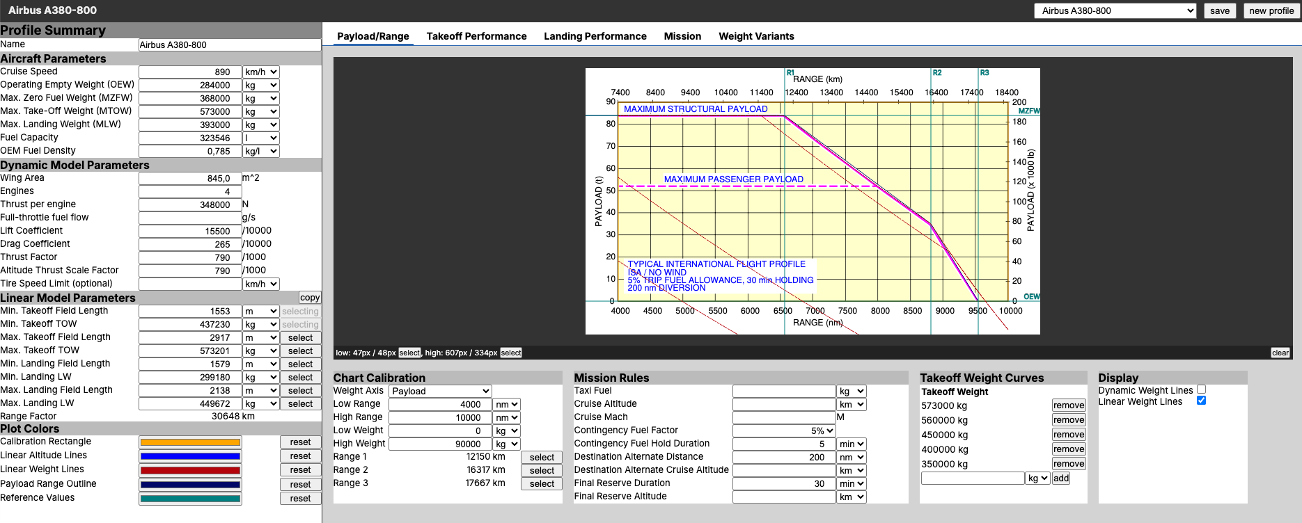
(note that the values in the screenshots are dummy data from my dev environment, not the actual parameters of the A380 in-game)
Game UI design work
On to the game’s UI…
Here I had to pick up where I left off quite some time ago. Back then, I got to the point of drafting some very basic wireframes of the general navigation structure, but I hadn’t even touched on page content or mobile UIs, let alone on any visuals (like colors etc.).
As you can probably tell from the above screenshot and the current UI design of the game, I am no designer. Like, not at all. I can come up with somewhat interesting UI systems when I have a greenfield project in front of me (I prototyped Prosperous Universe’s UI system within about two weeks), but as soon as things need to look nice I am far outside of my comfort zone. So whenever I pick up work on the next generation UI design for AirlineSim, I start running in circles, trying to sort out countless relevant aspects in my head:
- the visual language and structure of other games
- whether and what parts of the “professionally made” UI designs for the ASTD could be re-used (sunken cost fallacy, anyone?)
- which bits of the current design are worth keeping despite the dusty look
- how far should the design language be dialed towards “game’y” to make it more approachable?
- which references to real-world information management systems should be kept or introduced, if at all?
- should I go with an “implementation-first” approach and design while I go or should I learn new tools to go “design-first” and only implement things once I have everything planned out?
- how can all of this stuff be implemented?
- how and which framework can help with implementation?
- is it a good idea to adapt the basic design language of 3rd party UI libraries in favor of faster progress and at the cost of a less distinct design language?
- how can I make the switch to the new design a continuous process rather than one huge, risky conversion of everything at once?
- where do I need to comprise in terms of design to make the above work?
- generally speaking, how do I have to build the gen-3 framework in such a way that it works on all legacy pages without any jitter or visual differences?
There are many more, but you get the idea. If I were to try and tackle all of these at once, it would be a puzzle that’s near impossible to solve (for me by myself, within an acceptable timeframe). So when my head was about to explode, I admitted defeat and turned to my trusty rubber druck @molp to help me make sense of all of this.
And as it’s usually the case, this did help: In triaging all of the items above, the key criterion is “What is required when and for what?”. I am pursuing this project for two main reasons:
- Elevate the look of the game to make it more approachable.
- Introduce a more modern technical framework before adding new features and replacing legacy ones.
The critical realisation was that while 1. is an important mid- to long-term goal for commercial reasons, 2. is a real blocker right now and there are countless features that I can only really start working one once the new framework is in place.
So as much as I’d love to have a beautiful, modern UI design right now, the technical aspect is the important one. Applying a fresh coat of paint can always happen later. But rewriting something in a different framework is just that: A rewrite. And that’s something I simply can’t afford.
With this call made, work started flowing again and I am knee-deep in getting the existing bits of the gen-3 framework ready for primetime. This included the initial parts of a setup required for “full-page features” (as in: a new feature that requires a completely new page in the game, like the new DS search interface for example) as well as development tooling like linters and code formatters for frontend code (which I skipped when I was just “prototyping”).
The goal is to more or less maintain the current UI design but switch out the technical system that delivers the UI. Ideally without anyone noticing too much ![]()
Expect many progress reports over the coming weeks…