Just as planned, I moved on from the “headless UI library” migration to the “header conversion”.
Reminder: The goal right now is to implement all shared UI components (as in: the header and footer of the page) in new “3rd generation framework”, such that
- those components live in a single place rather than in both the gen-1 and gen-2 legacy frameworks and
- new features can be built exclusively using gen-3 framework.
In a first phase, I migrated the rather simple footer to gen-3 using a library that brought its own styles. Then I decided I don’t like the latter aspect (see previous devlog) and converted everything to yet another “headless” library, meaning without any third-party styles. Now I am using gen-3 with that new library to convert the header.
Naturally, this is a lot more complex than the footer: There are a lot more components and many different criteria apply when deciding what to display (like on mobile devices or when playing within Steam). Also, rather than just re-implementing the current structure, I am using the opportunity to improve the header and the main navigation in general.
Here’s a very much work-in-progress version of the new header:
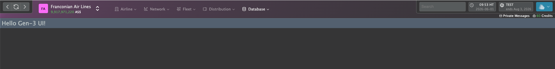
Nothing here’s final yet, just a few notes:
- The navigation on the top left is only visible when playing in Steam.
- The tint/gradient in the background is based on the “brand color” of the airline, which in this case is a (random) pink’ish hue. This will almost certainly be configurable (custom color and/or option to disable the feature). This is an idea from the Technology Demonstrator that people seemed to like quite a bit when seeing the screenshots.
- The main navigation will have more top-level categories. Each has an icon so it can be collapsed to a proper mobile navigation when on small screens.
- The items on the right (design not final!) are for “meta features” and I’ll try to condense them as much as possible. The screenshot is still missing a few items that are present in the current design, like the community and the help menu. Some of that will move elsewhere, for some I’m still considering where to put them.
- The “branding” and the “account” components have been combined and visually reduced because I realised that hardly any “actual game” wasted screen real-estate to wave its logo in front of players. Also, the account should be a technical detail and not something you need to see on every screen.
- The line below the meta components is almost certainly going to vanish: The credit balance is something that mostly becomes relevant once it drops below a certain threshold, in which case a marker of some sorts can be shown in the UI, and the “private messages” are very small, especially if one considers an additional “unread messages” badge. So the former is likely going to get moved to the game menu, the latter will get it’s own top-level component.
But as said…it’s all work in progress. The coming week will be a short one as I am meeting Michi at simulogics HQ for (primarily) Prosperous Universe-related things. But I’ll keep you posted about my progress, of course.